The Hackathon
there was this hackathon i took part in about three months ago, the Notion x Vercel AI Agent Hackathon on Friday 21 Aug 2026. Our team: me, Vivek, Nathan, and Karthick, wanted to tackle a frustration that was close to us, and close to every Melburnian
you take the same route so often you stop checking the app before you leave, you just know when it comes but then one day there’s disruption and you didn’t check, because why would you, and that one gap throws your whole day off before it’s even started.
so we set out to build a feature for Notion Calendar that actually accounts for that, mainly for public transport in Melbourne
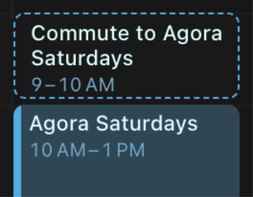
Teaching a Calendar to Read Timetables
this was very much a proof of concept. under the hood it needed two things: a map of the network, and a way to search that map fast enough to be useful
the map came from GTFS, the standard format transit agencies publish timetables in: stops, routes, scheduled times. on top of that we layered Melbourne’s real-time PTV API, which reports where vehicles actually are and what’s actually delayed right now. so we had both the plan and the reality
searching that combined map is where bi-directional Dijkstra came in: it searches from your origin and your destination at the same time and meets in the middle, which is what let the backend answer “what’s my fastest way there, accounting for what’s running late right now” without taking forever to compute
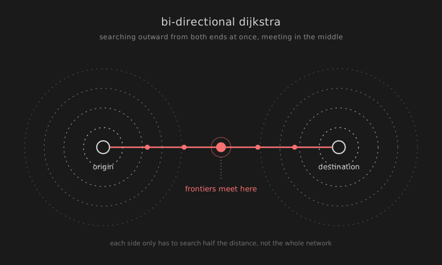
it was held together by hackathon-grade duct tape, but it worked end to end, and we guess what we even won the Best Technical Implementation for it
The Itch That Followed
the hackathon ended, the adrenaline wore off, everyone went back to their actual jobs. but one part of the project wouldn’t leave me alone. while we were building the routing engine, i’d thrown together some rough visualisations just to debug it, to actually see the graph search happening instead of staring at coordinates in a console
and it looked way cooler than a debug tool has any right to. i kept coming back to it that week, more than i was thinking about the actual routing engine we’d set out to build
that’s usually a sign worth paying attention to: when the thing you built to check your work becomes more interesting than the work itself. so i kept going on it alone, past the hackathon, past the point anyone was asking me to. what if, instead of a tiny debug view, there was a full digital twin of the entire PTV network: a live 3D replica of the city with every train and tram actually moving through it, not just a map with dots on it
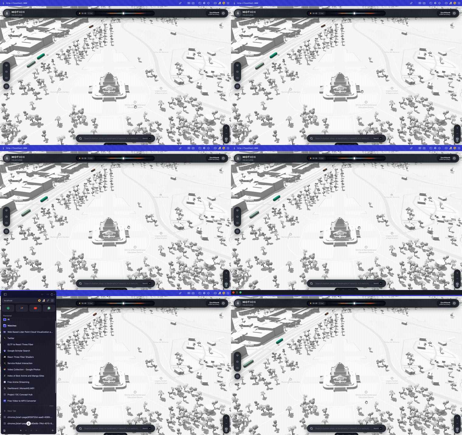
i put an embarrassing number of hours into the visualisation and the feel of actually using it: extruded buildings, trees, landmarks, all in a quiet monochrome palette, with each line’s trains and trams in their real PTV colours, gliding along actual road and rail geometry instead of an abstracted line graph
What the Twin Actually Does
the UI is built around being able to drill in. the sidebar lists every metro line with how many trains are running on it right now; tap one and it unfolds into its full station list, interchanges included. tap an actual train or tram on the map and you get a live card for that vehicle: its line, how far away it is, service state, trip ID, plus buttons to fly the camera to it or highlight its whole route across the city
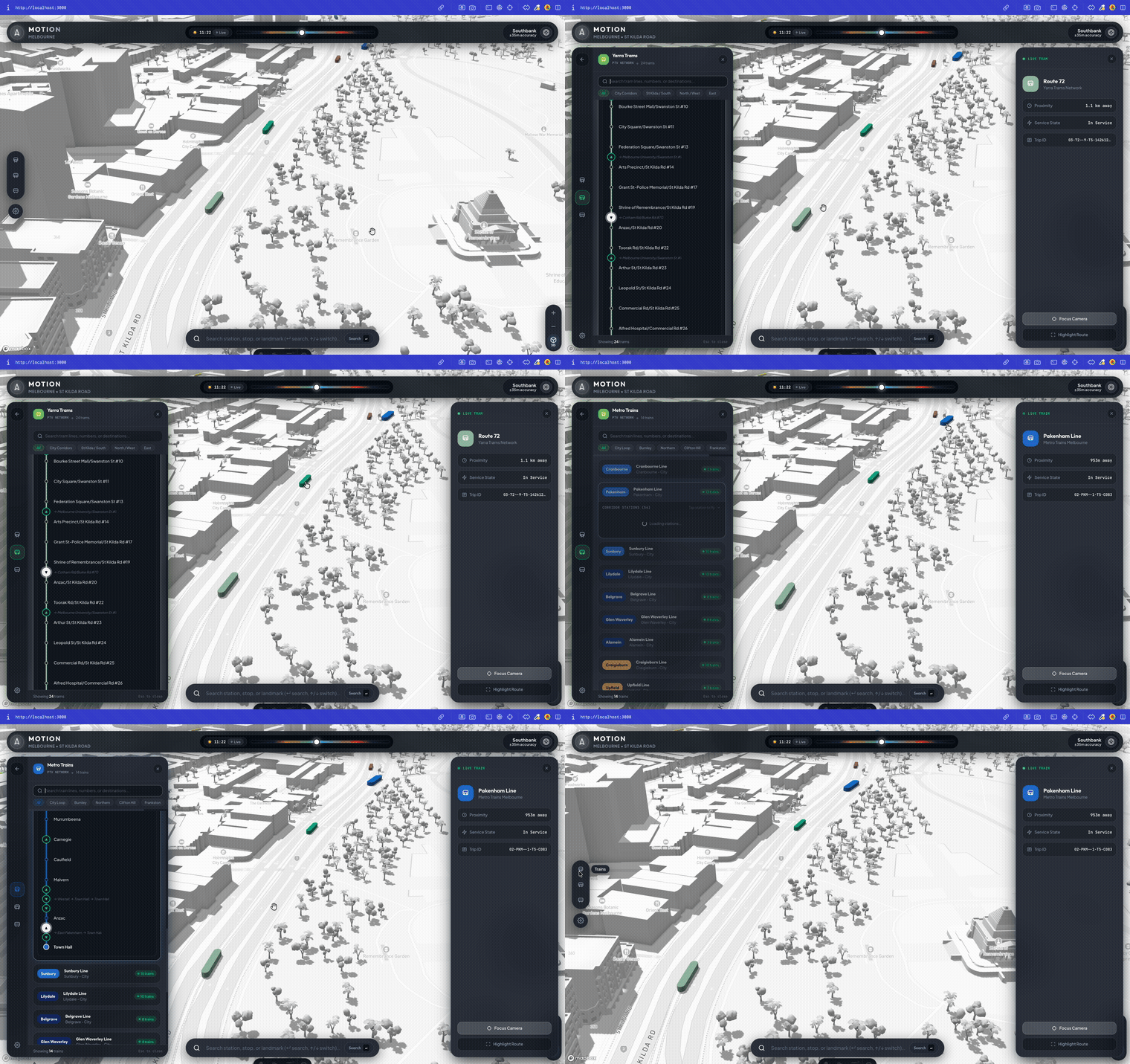
you don’t need to already know a station’s exact name either. the search bar understands stations, stops, and landmarks interchangeably, so typing “southern cross” or “acmi” flies the camera straight to the result
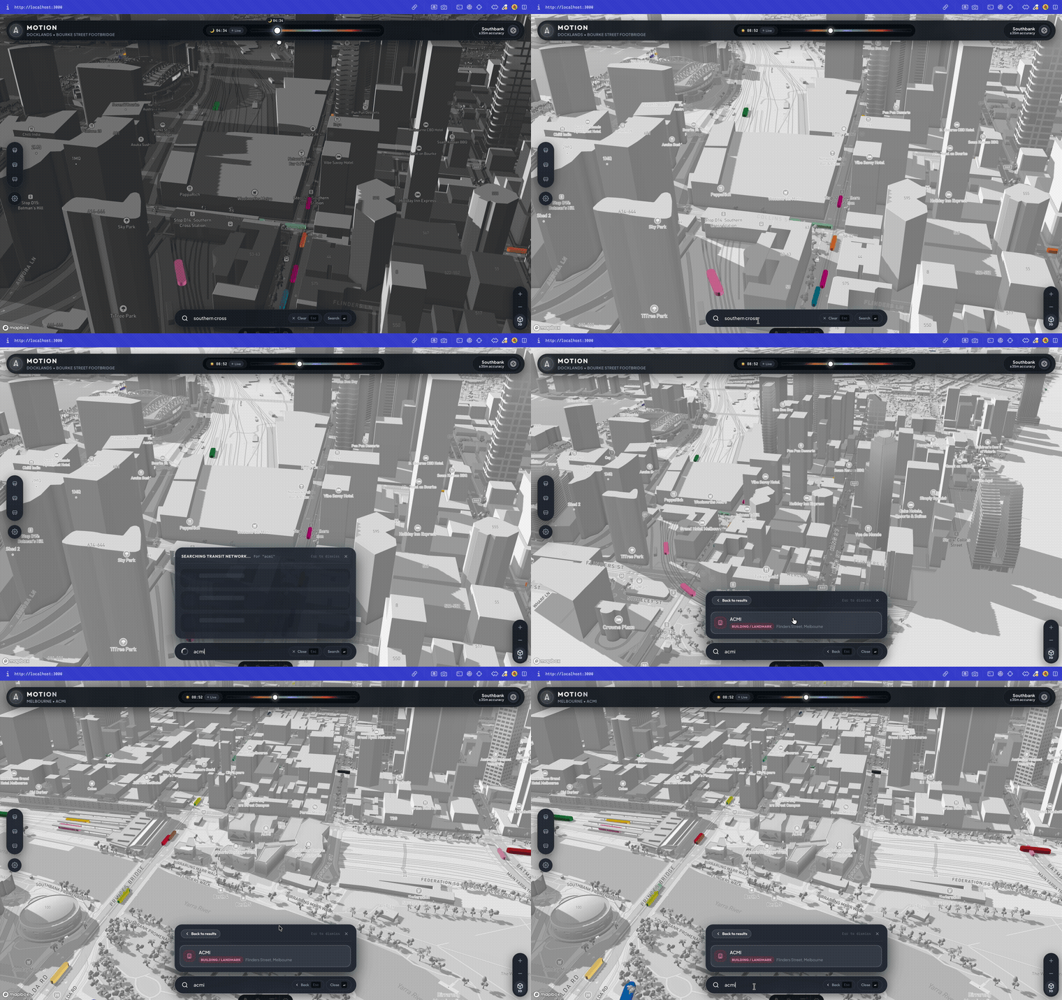
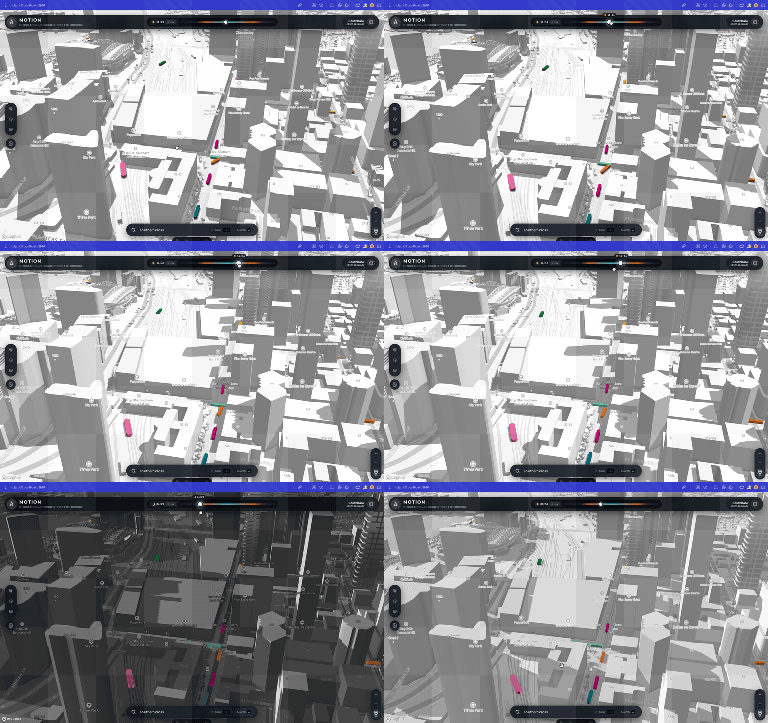
and none of it is locked to right now. the time readout up top doubles as a scrubber: drag it and the entire network, every train, every tram, moves backward or forward through the day with it. drag it late enough and the little sun icon flips to a moon, the whole scene reading as night instead of just a label saying so
The Bill Arrives
here’s the problem: the part that made this genuinely useful, the real-time delay-aware routing, the bi-directional Dijkstra engine constantly querying live positions, was also the part that cost actual money to keep running. this was never a project trying to make money, it was a hackathon prototype that grew a second head
and here’s the part that proved the signal from earlier was right: the expensive routing backend wasn’t what people reacted to. everyone who saw this project lit up over the digital twin itself, watching the whole city’s transit network breathe in real time. that was the actual thing worth showing people, not the Dijkstra implementation nobody but me cared about the internals of
so the honest move was obvious: keep the part people actually connect with, let go of the part i can’t justify paying for indefinitely. the debug tool had quietly become the product, and the actual product had quietly become overhead
but it also raised the real question: if the transit data itself isn’t the differentiator, since every map app already has that, what would be?
The Dream: Notion Maps
if i let myself dream about where this goes, it’s not me hosting a routing backend forever. it’s Notion folding this into Notion Calendar, or going further: a Notion Maps
the differentiator would be brand fit, not transit data, every map app already has that covered. Notion’s audience already lives in productivity tools, shows up to co-working sessions, and turns out for events like Agora Saturdays just to be around other people building things. a map that helps that crowd find each other, not just find a train, would make sense coming from Notion in a way it wouldn’t from anyone else
and maybe that’s the real opportunity: not another transit app, but a quiet way into the market Luma, Humanitix, and Meetup are already fighting over, one Notion would be walking into with an audience that already shows up
that’s a big dream for a weekend project, probably too big. but the hackathon proved the concept, the digital twin proved it’s worth looking at. for now, it lives as what it honestly is
What’s Live Now
i stripped out the expensive moving parts, the live routing backend and the constant real-time API calls, and kept the digital twin: the simulation, the visualisation, the interaction design i’m genuinely proud of. deployed it the same way everything else of mine ends up live, my own GitHub plus Vercel
what’s live today is the transit layer. the dream above, the productivity layer, is the part i think is actually worth building next, and the part i’d want to build with Notion rather than around them
check out Melbourne in Motion, the whole network, live, in your browser
huge credit to Vivek, Nathan, and Karthick for building the original hackathon engine with me, this whole digital twin only exists because that weekend worked
until next time !️ ✌
or you could spot me in the wild 🤭 i mean instagram, twitter, linkedin and maybe even youtube where i may make video versions of these blog posts